Inside the Little House
😀
Lots of "Beginning" pictures
(showing loads of issues)
If we start at the beginning, then I guess we will start with 'before' pictures. The project is getting far enough along now that we have to look around to find 'before' spots. Some folks were visiting the other day and most of the comments were prefaced by "well, it used to look like (fill in previous objectional condition here)". However, here on the internet, we have the option of using 'before' pictures and we can add in a lot of them. Tons of progress has been made, but there's still loads to go although we're getting to the point to where we can almost see the end. Maybe.
Some of these 'before' pictures are from before we even owned it. That's the Realtor's paperwork on the red tile counter top although we didn't have the Realtor with us to do a walk through. We never even really met the Realtor. Half the time the people looking through the little house left the door unlocked behind them so we could see the inside pretty much when ever we wanted.
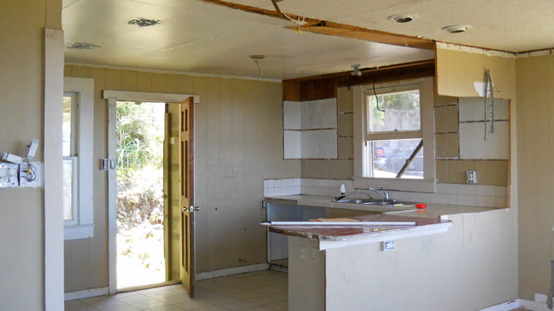
Hackers were here! Except they got walls, appliances and fixtures instead of software.
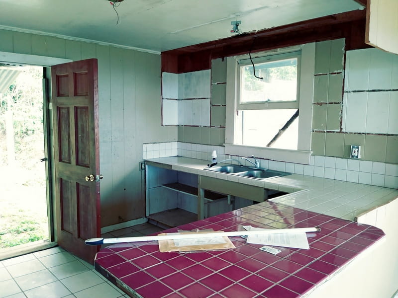
Before we bought it, the Realtor's paperwork is still on the counter
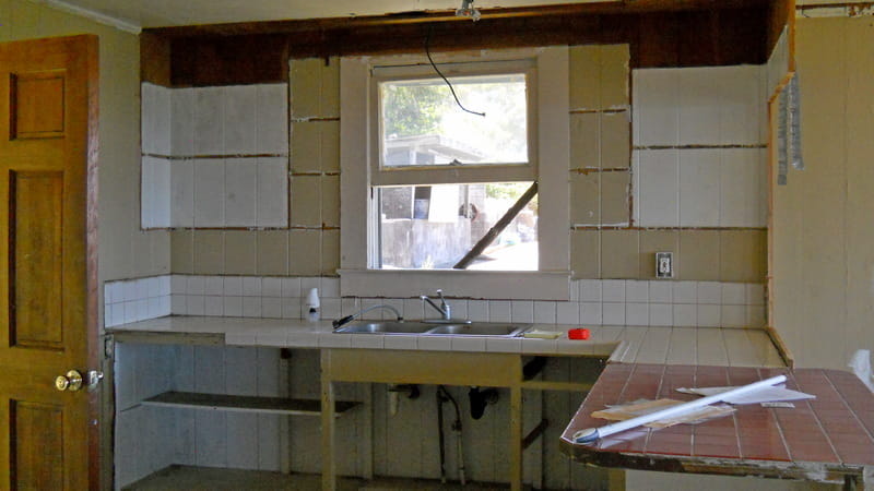
stick holding the window open, no cabinet drawers or doors
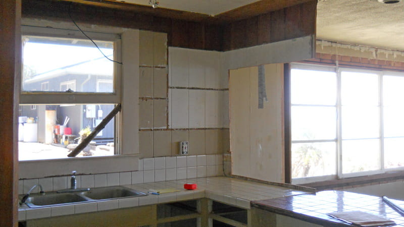
Not quite sure what they had planned on doing? Hacked out the wall, though.
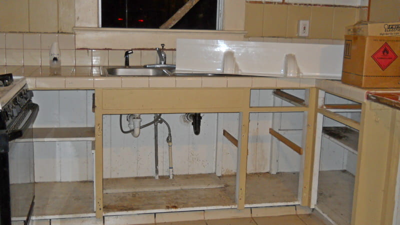
No drawers or doors, not sure why they left the sink?
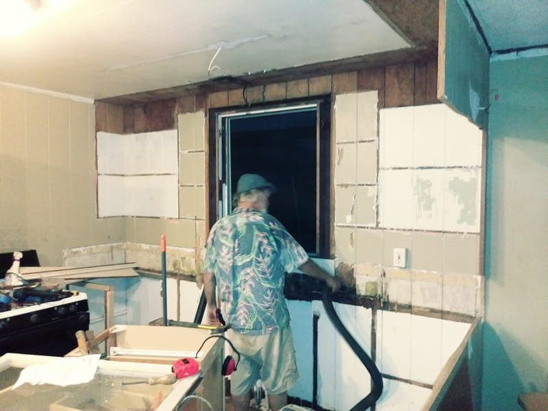
getting it ready for new cabinets
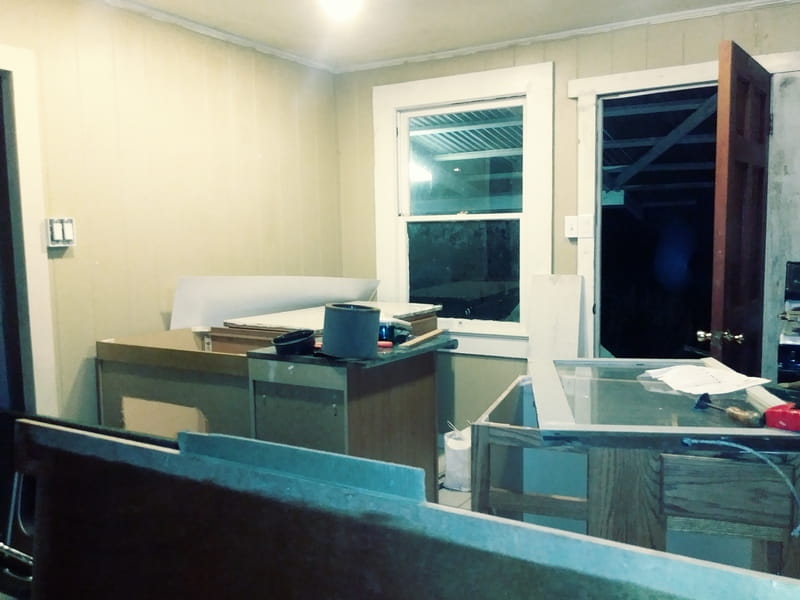
very small dining area looks even smaller in a construction zone
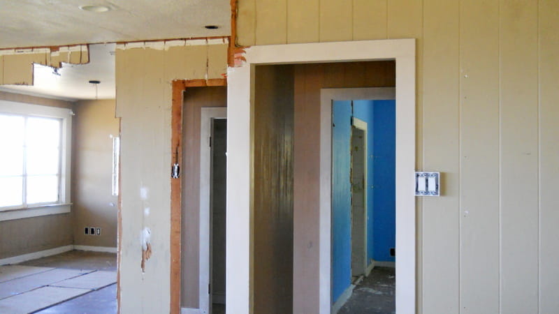
kinda half the dining area as it blends into the hallway to the very blue bedroom and into the living room with the hacked out wall there
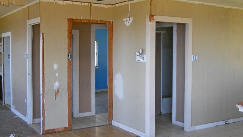
Lots of doors for a little house, all interior doors were missing as well as a lot of the door trim
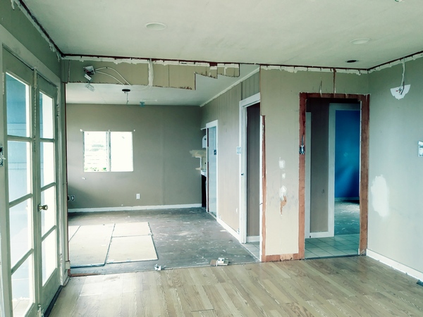
Before this wall was hacked out, it was a two bedroom house
Most of the hacked out wall damage, fixture removal and door removals had been done by the squatters who claimed they owned it and also claimed they were repairing and renovating it. Not sure if they put in the red tile on the counter or not, or which parts were done by previous owners and which parts were done by the squatter's 'improvements'. The tile kitchen floor is nice, although larger tiles on a wood substrate isn't what I would have chosen. There's already some cracked tiles which is to be expected in that type of installation.
It's now December and we've been fussing with this fixer upper since July, so it's been awhile. We have a 'work crew' of two and we don't work consistently so things don't happen quickly. Well, those are the 'before' pictures, let's see if we can find 'construction' pictures as well as some more current and hopefully more done pictures, although we won't have any really officially done interior pictures until at least after the ceiling is done.
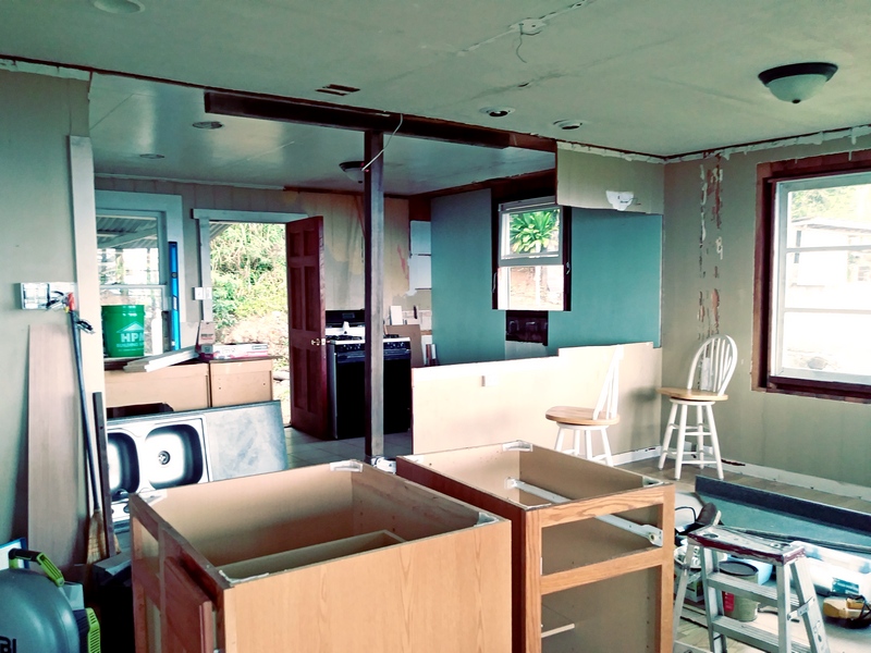
Pushing the ceiling up with a floor jack
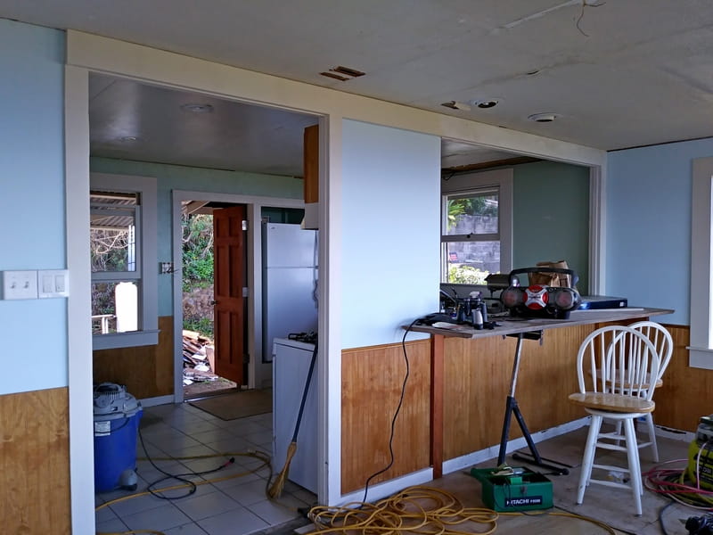
It's starting to show some progress
Before & Current
(mid-December 2019)
In the picture on the left, that's a 'construction' picture. We're jacking the ceiling up, got new cabinets ready to be installed, have the window trim off the kitchen double hung sash window so the sash weights can be fixed, there's a couple sheets of plywood on the walls (the green parts). The damaged walls in the living room are still visible. The trim is off the big living room window. In these old single wall type construction houses, the window trim is actually structural. Not that you can tell, but the living room floor sags towards the front corner. But it's still definitely a 'during construction' picture.
In the picture on the right, the ceiling has been pushed up, there's now a beam there to keep it there instead of the wall that had been hacked out. The eating counter between the kitchen and the living room is a plank of silky oak, but it's just temporarily placed there. The actual installation will have it more into the kitchen and slightly shorter. In the picture on the left, the ceiling is being pushed up with a floor jack, post and temporary beam.
In the second picture, no more sagging ceiling - no more sagging living room floor either, for that matter. The walls have been resheathed with plywood since there had been too much damage to repair and paint and have them look nice. They were mostly structurally sound, but there was no way to put a nice finish on them. The original walls are 1" x 6" T&G vertical boards. That has a vertical groove between each board and at some point someone had tried filling in the groove with bondo? Some sort of goo, anyway, and it wasn't pleasant.
We had decided on the wainscotting when we saw it at the store since it would look nice and increase the 'beach cottage' feel we're trying to achieve. Then we had some wall panels up and thought it looked pretty good and maybe we didn't actually need the wainscotting. Then the delivery truck showed up with the wainscotting (and asphalt shingles) which we had forgotten that we had already bought so we decided wainscotting was actually probably a good thing. I think it turned out lovely. Now we're thinking maybe wainscotting painted creamy white would improve the ceilings? The ceilings need something and drywall is pretty heavy, the wainscotting is a light plywood. The ceilings are going to be one of the next big projects after we get the current projects of the bath and front lanai finished.
Another difference between the two pictures is that the kitchen door has been completely reframed so it now shuts properly and swings outwards instead of taking up space in the kitchen. We may build a cute wooden screen door, that will increase the 'cottage' feel.
The refrigerator now lives in a niche. That has ventilation at the top and bottom and completely makes the refrigerator seem to vanish when you're in the kitchen. Kinda feels odd to have to look around for the 'fridge, in most kitchens you can feel it looming no matter where you are in the kitchen. Here, even though it's a pretty small kitchen, you don't get any feel of large 'fridge looming around. Maybe it's a 'you have to be there' kinda thing to properly appreciate it?
Here's some kitchen pictures to explain why the niche was constructed, even though it made the project longer.
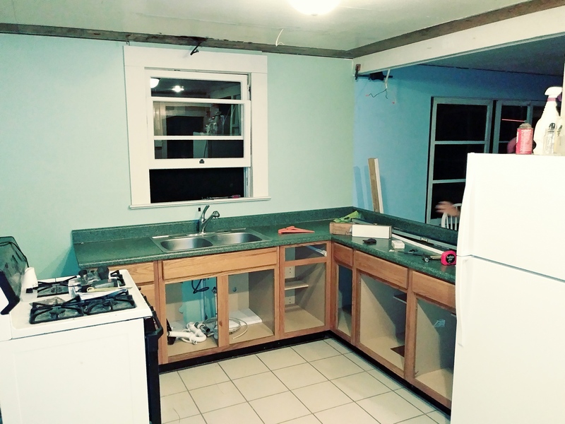
test fit to see if the new cabinets fit
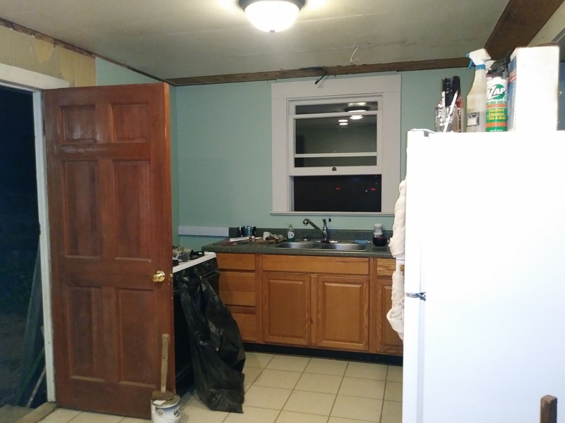
cabinets installed, but poor kitchen layout
mid-Construction pictures
(or figuring things out as we go)
As we started getting the cabinets, counter tops and appliances into the kitchen, it was becoming obvious that (A) it's a pretty small kitchen and (B) it's not laid out very well. Guess one makes the other more obvious?
It's a small kitchen, which is probably why those folks with the SawzAll had been hacking out walls. They were attempting to fix the problem, but taking out the wall to make the kitchen bigger only works if the counters are moved as well as the wall taken out. It also only works if the wall wasn't holding the ceiling up.
From what we could figure, the previous refrigerator location was against the other kitchen wall, which would have then pretty much meant there had been no room for a dining table at all. There's still not much room, but a small table and a couple chairs will fit there now.
With the stove against the wall behind the door, you end up with a door in your cooking area. The stove also blocked access to the counter top and in a small kitchen, losing several feet of counter space is much worse than if it is in a bigger kitchen. Putting the refrigerator behind the door would have been worse. Between the door swinging into the kitchen and the refrigerator looming over on the other side and effectively cutting the room in half, it really felt cramped and not very comfortable.
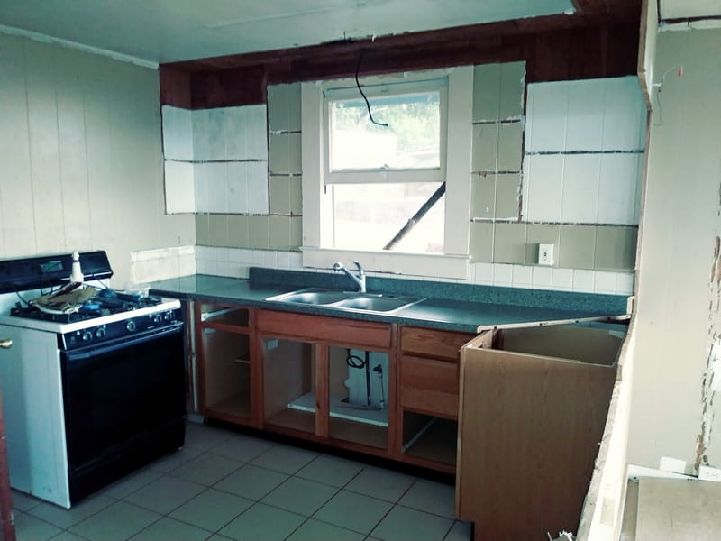
poor kitchen layout even with the door not open
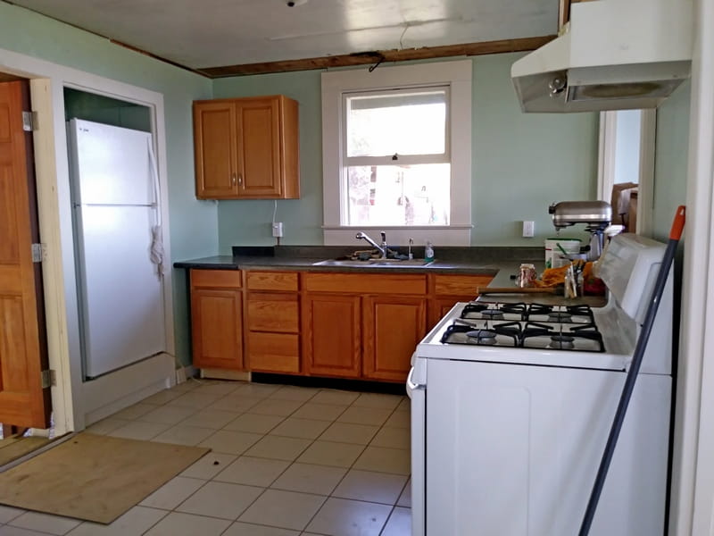
current picture as of mid-December, 2019
Even with the door closed, the kitchen still didn't have a very workable floorplan. The door visually cut the kitchen in two and even if it was closed, the refrigerator did the same thing from the other side of the room. Which is why we spent the time and effort to build the little niche so the 'fridge could be stuffed into it. Actually, it's got breathing room on all sides as well as vents at the back, but visually it's 'stuffed' away and gone.
The door has also been rehung so it now swings outwards and has a door stop on the side of the refrigerator niche. It now opens out of the way and stays out of the way.
Moving the fridge into it's own niche technically only gained nine square feet of kitchen space, if one goes by the floorplan. Visually and feeling wise, it makes a huge difference.
If you like, you can send us an email and ask about bunnies, yarn, Hawaii things, what we should have on our webpage or just about anything else.
Mail to: Hillside Farm Hawaii